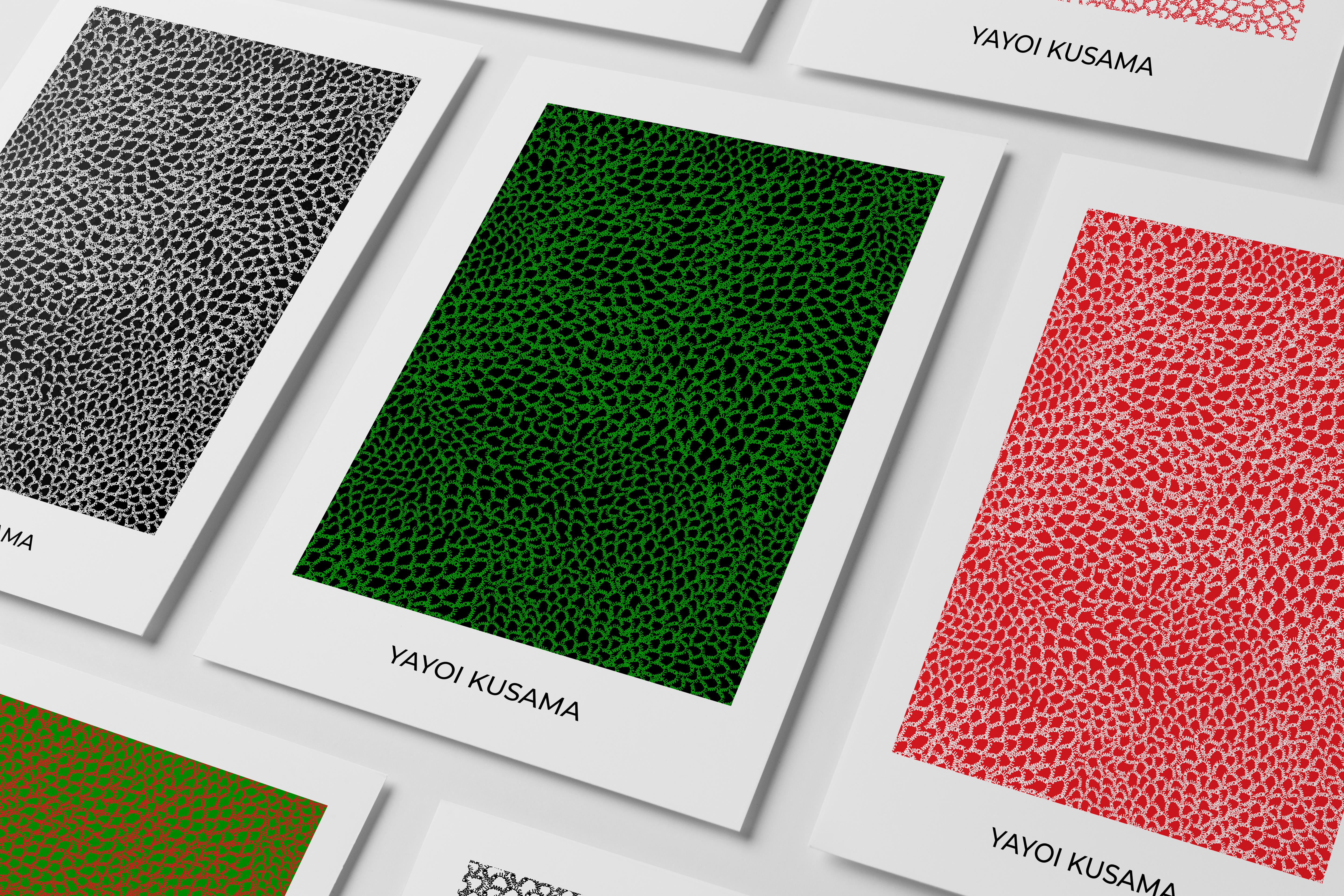
COME CLOSER Yayoi Kusama
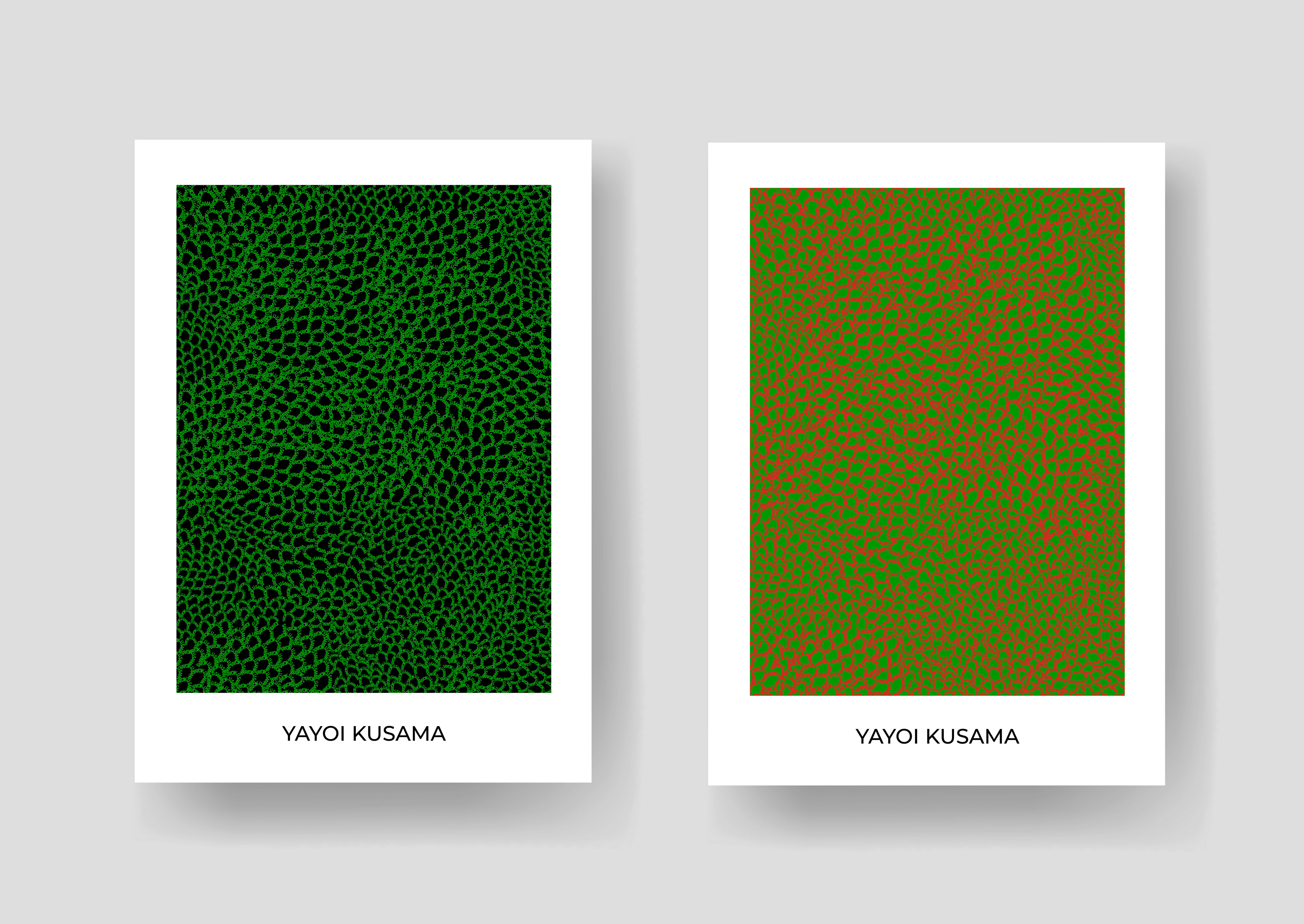
COME CLOSER focuses on the essence of an artist and their work. The series invites the viewer to take a closer look at the recreations of famous artworks, discover which artist they belong to, and examine the techniques they used.
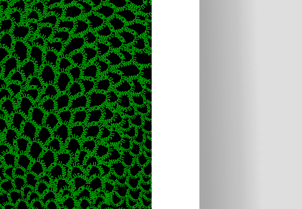
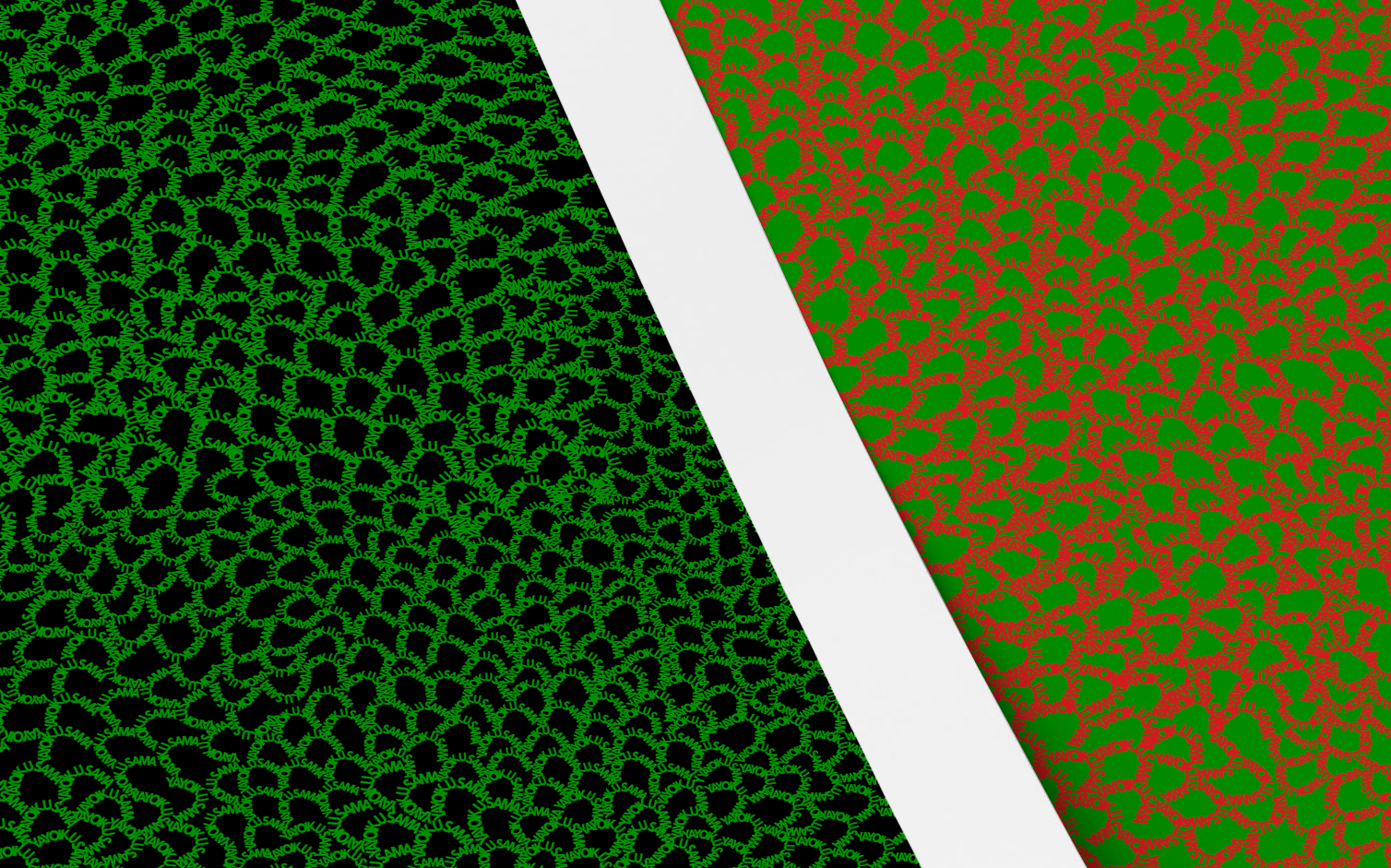
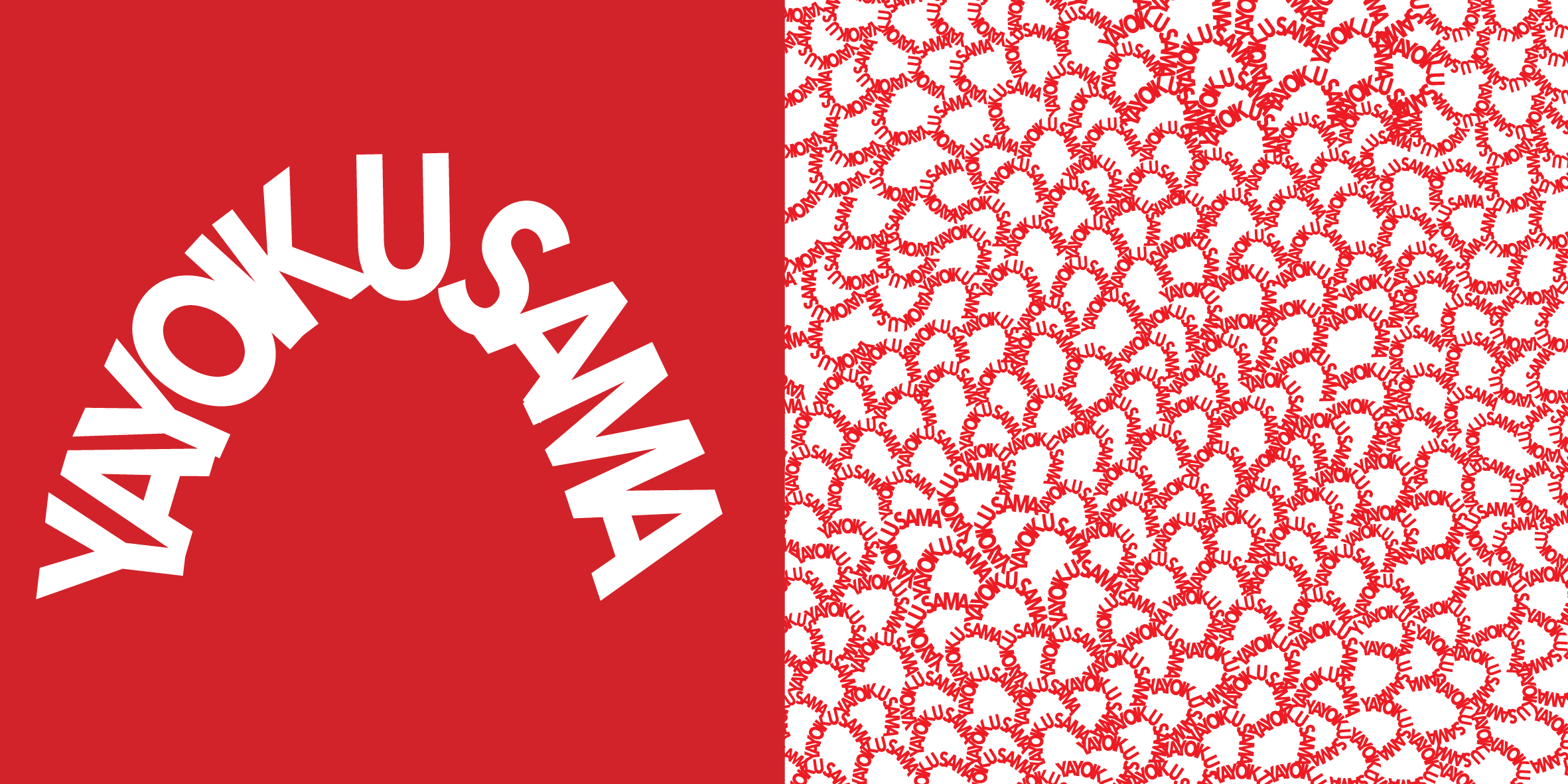
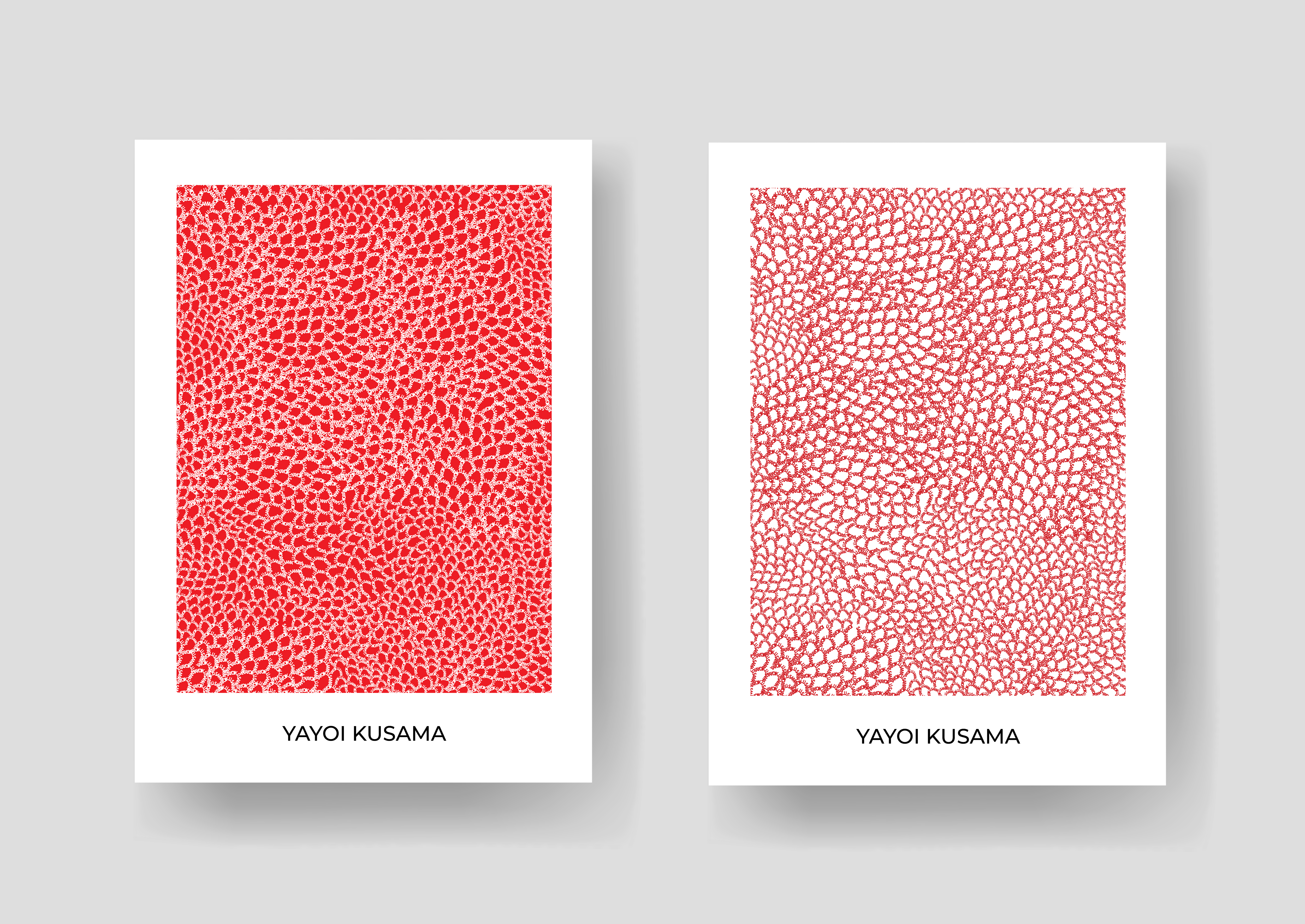
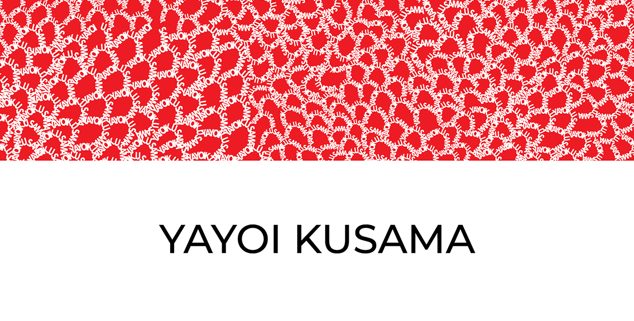
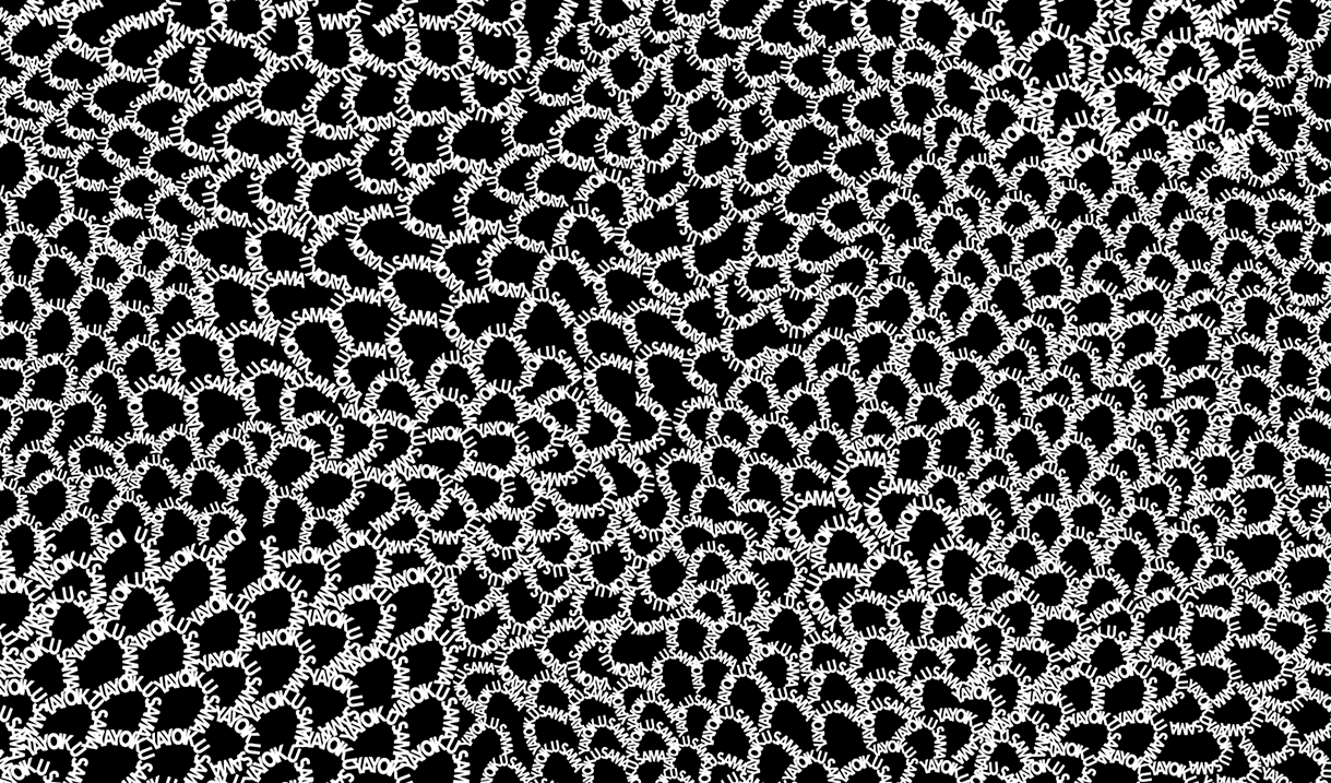
What from a distance might seem like the original, up close reveals its true nature. Each brush stroke is made from the artists' name, transforming the artwork into a signature itself. In case of Yayoi Kusama, a block of color transforms into a net of U-shaped brush strokes, a technique characteristic of her art.
It was very important for me to represent Kusama's paintings as faithfully as possible, so that they may reflect their spirit. But making sure that the pattern looked original-like both in miniature and scaled-up proved quite troublesome. Because Kusama’s style is very organic, it heavily depends on the pressure applied and the flow of brushstrokes. They blend into each other and become infinite nets.
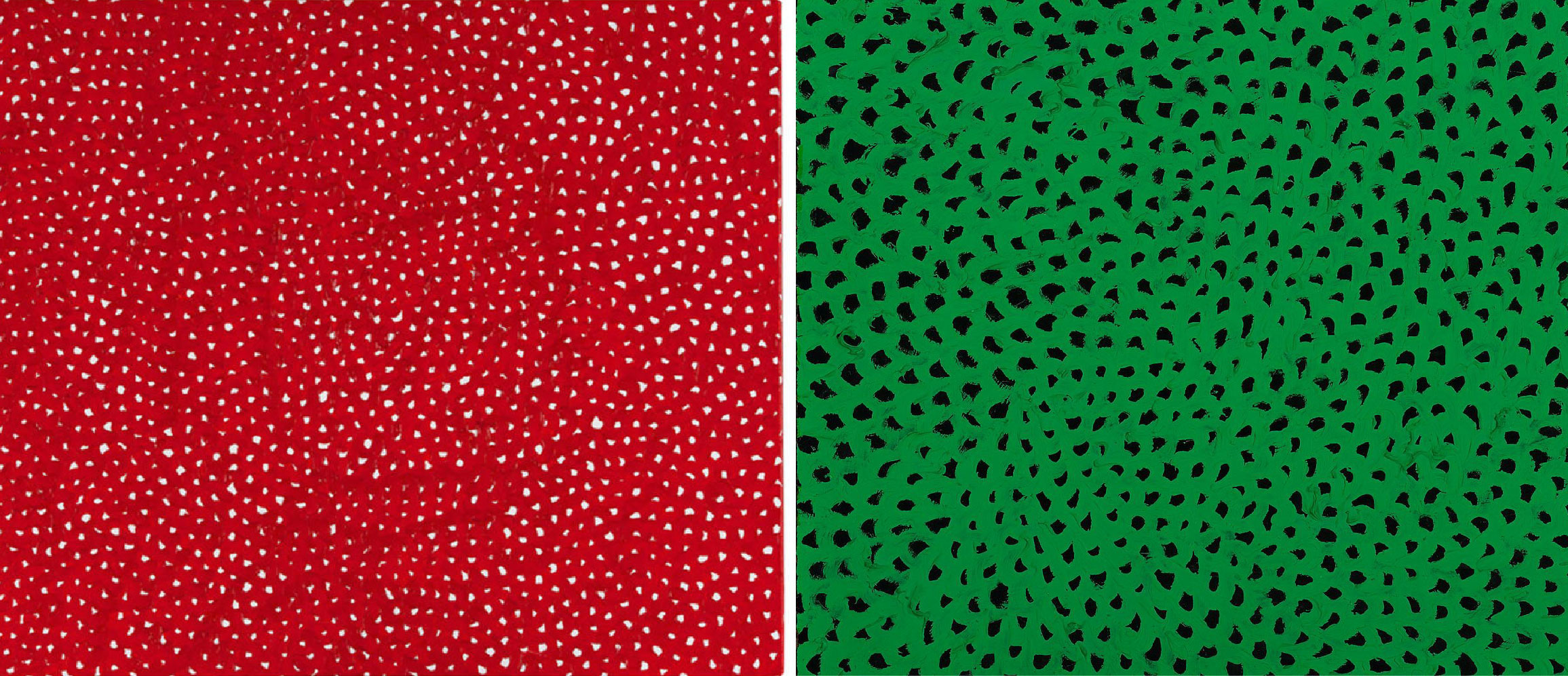
LEFT: Yayoi Kusama,Infinity Nets [OOQH], 2006
RIGHT: Yayoi Kusama,Infinity Nets [No. Green. No. I.], 1961
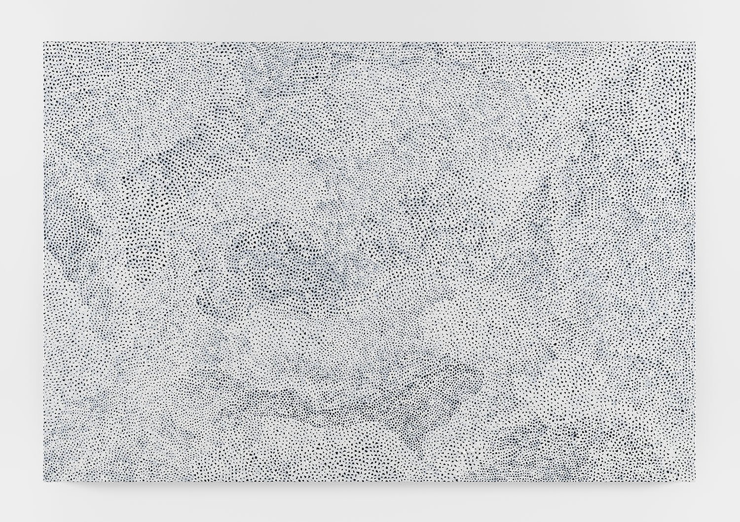
BELOW: Yayoi Kusama, Infinity Nets[XSHTQ], 2017
It was digitally challenging to showcase the unity of the grid-like design, once a brushstroke was replaced with rigid vector letters. The outcome is not as full, as connected, or as bold as the original painting, because the signature could either be bold and incomprehensible, or lean and readable. The heavy overlapping of letters simply doesn't look as good, and it's not as coherent. So I chose to focus on readability as it's essential to the core idea of the Come Closer series.
From there on, the possibilities of color combinations were endless, which thinking of it now is quite fortuitous, because Kusama’s nets are infinite themselves.
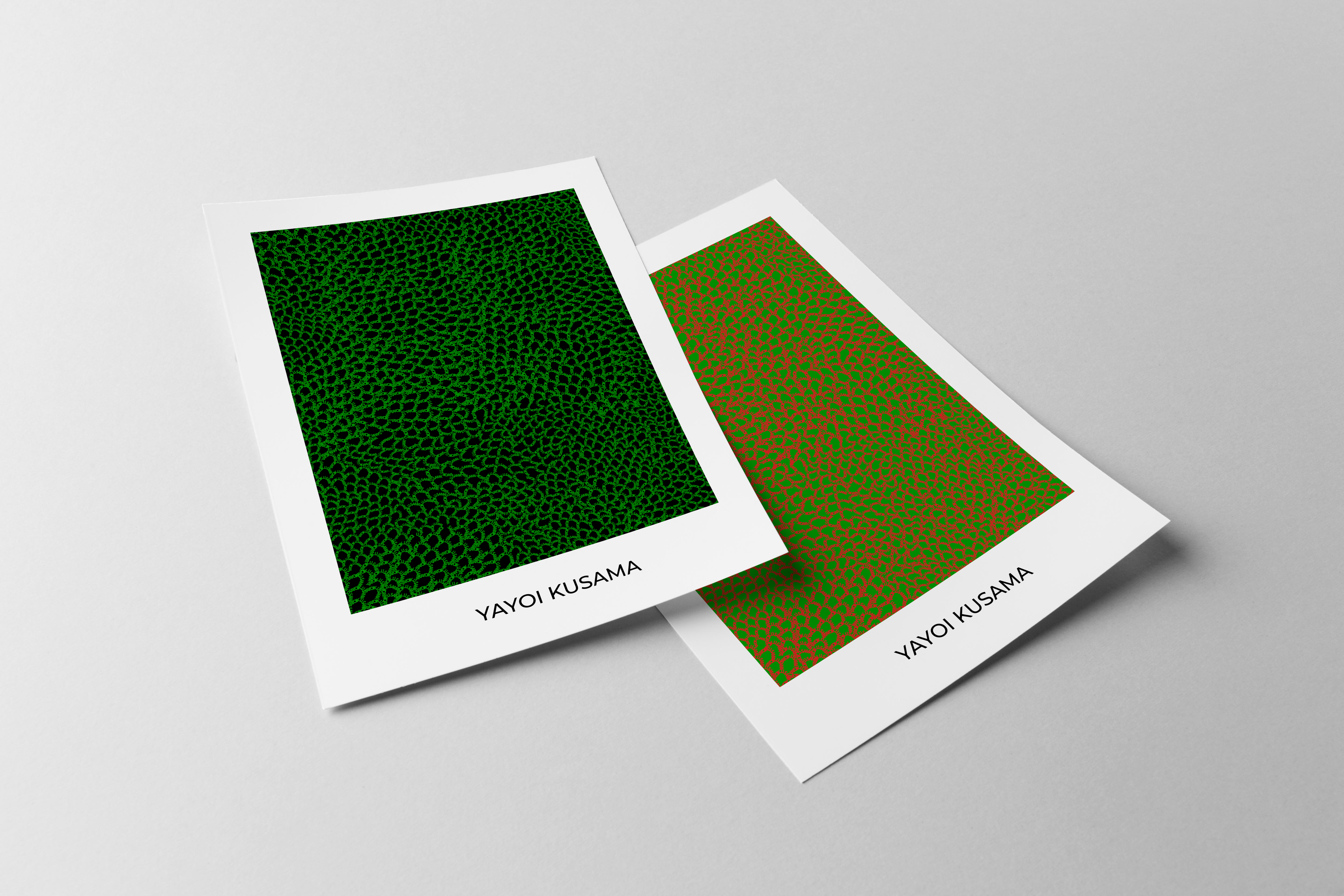
COME CLOSER Yayoi Kusama posters White on Red and Red on White.
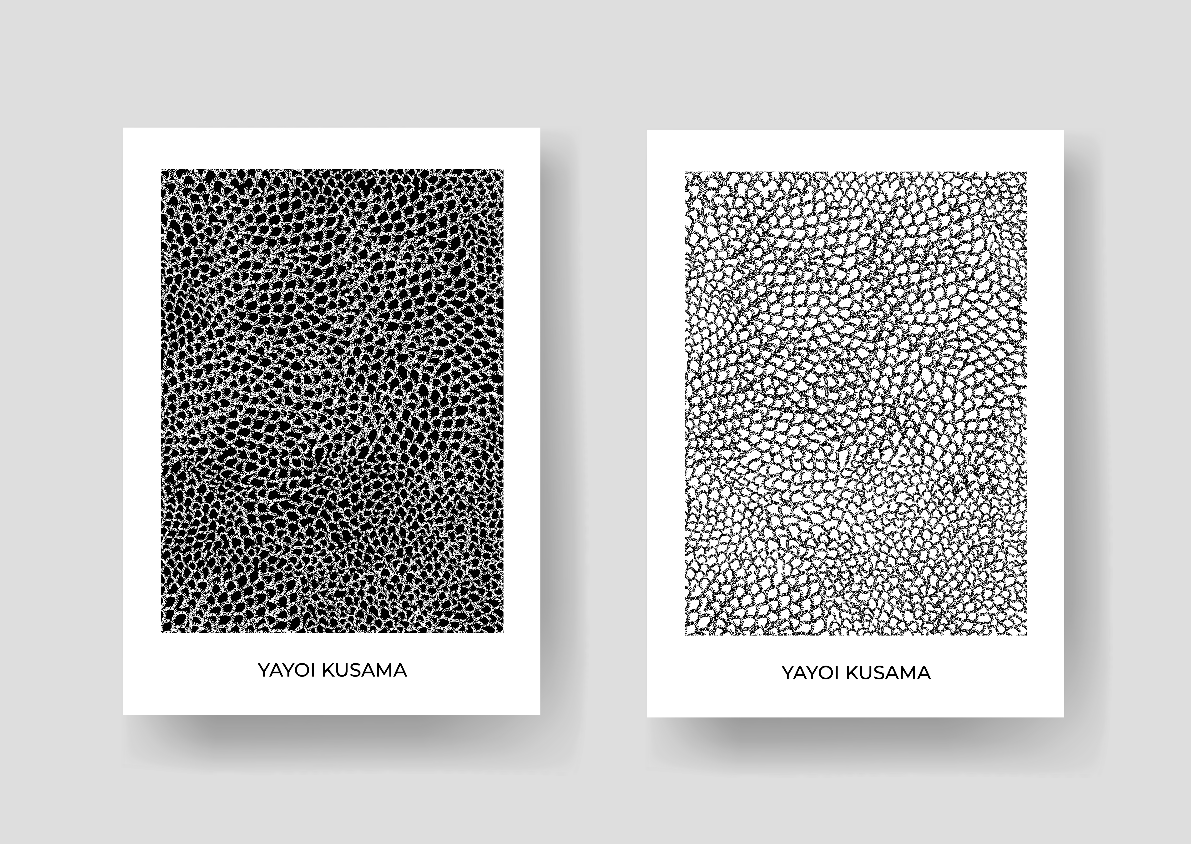
COME CLOSER Yayoi Kusama posters White on Black and Black on White.
COME CLOSER Yayoi Kusama posters Green on Black and Red on Green.
